10 Best Data Visualization Techniques With Its Types, Usages, and Examples
Data visualization techniques are effective ways to represent numeric and text data in clear and insightful charts, bars, graphs, and dashboards that help answer business questions. With the right visualization methods, people with non-technical backgrounds can easily understand the data quickly and take action.
Learn these effective techniques, when to use which chart types, and helpful examples for your next project.
Quick Answer:
The best data visualization techniques use bar charts, scatter plots, line graphs, pie and donut charts, heat maps, tree charts, and interactive dashboards. The right technique varies depending on your data type and the business question you want to answer.
What Is Data Visualization?
Data visualization is a powerful skill of representing data in graphical and visual formats using charts, maps, or dashboards. It helps business owners find patterns, trend lines, and comparisons. It fills the gap between data in text format and human understanding.
Not all can easily understand the patterns quickly just by looking at 20,000 rows of data. But when you see the same data in a line chart, it becomes very easy to compare sales, notice the highest-selling product, or even the growth of a company in just a few seconds. This is the most powerful impact of visualization.
Pro Tip: Data visualization is not just about creating interactive charts and dashboards. Make your goal to use the right methods that auto-answer the business questions.
Why Data Visualization Techniques Matter
Using the correct data visualization technique not only just looks perfect but also answers business questions. For example, a pie chart with four to five data points is perfect for comparisons. The right method shows clear insights that help businesses make faster decisions.
Here is why visualization is a powerful technique:
- A human brain can process visual information in 13 milliseconds, as shared in the report “In the blink of an eye” by MIT.
- Poor visualization techniques lead to incorrect conclusions.
- The accurate chart helps business owners reach a conclusion much faster.
- Using the right methods builds credibility in presentation reports.
- The perfect visualization charts automatically answer most business questions.
These are the reasons why powerful data visualization is one of the in-demand skills in 2026.
10 Core Data Visualization Techniques Explained
Here are the most important data visualization methods used by professionals for business intelligence, analytical dashboarding, and insightful reporting. Each chart type is perfect for a specific data type to answer business questions. You can consider this part as a reference guide for charts.
1. Bar Chart
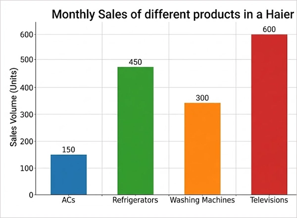
A bar chart is an effective example of data visualization when you have to compare values with multiple categories. You are free to use the bars either horizontally or vertically. It is better to use for quantity comparisons in specific groups.
Perfect for: To compare different categories side by side
Example: Monthly sales of different products in a Haier store.
Ignore: When comparing more than 10 categories, as the chart is difficult to track
2. Line Chart
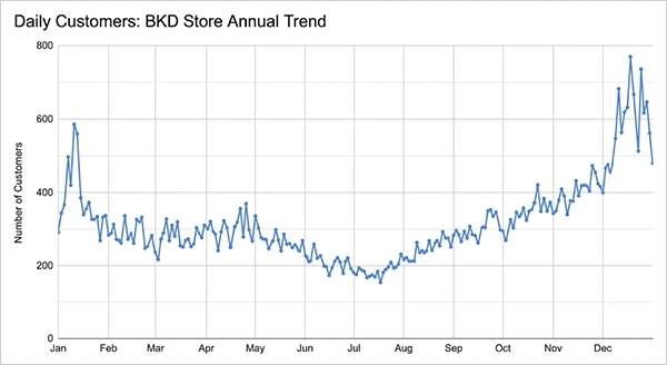
A line chart is a great choice to track ups and downs over time with data points and continuous straight lines. It is one of the most powerful techniques for data visualization to track growth, seasonal patterns, and trends.
Perfect for: To track trends over days, months, or years.
Example: Daily customers at a BKD store in a year.
Perfect: For comparing categories without a time element
3. Pie Chart and Donut Chart
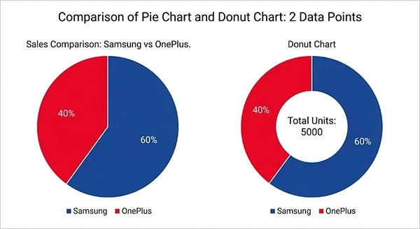
A pie chart perfectly shows how a total is shared into parts. A doughnut chart also looks the same but has a hole in the center, making it easier to add a central label. Both are perfect examples of data visualization charts, perfect for up to 2-3 data points.
Perfect for: Representing proportions with fewer than five data points
Example: Sales comparison of Samsung and OnePlus phones
Ignore: Using data with many slices or multiple data points.
4. Scatter Plot
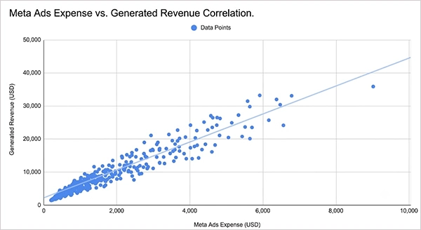
We place data points on the X and Y axes in a scatter plot chart to show the relationship between two different variables. It is one of the most common ways to visualize data when finding clusters, relations, or outliers in a large data set.
Perfect for: Locating relationships or correlations between two numeric values
Example: Meta ads expense with generated revenue for correlation
Ignore: With fewer than 20 data points, as the patterns are no longer helpful at a small scale.
5. Heat Map
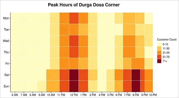
A heat map chart has color intensity, which shows venues in grids. Using this chart type is one of the important data visualization skills to track patterns with the 2-dimensional matrix.
Perfect for: Representing frequency, density, or stock market trends
Example: To track the peak hours of Durga Dosa Corner, showing the number of customers at a specific time.
Ignore: When your audience doesn’t know color codes, do add a legend for them.
6. Area Chart
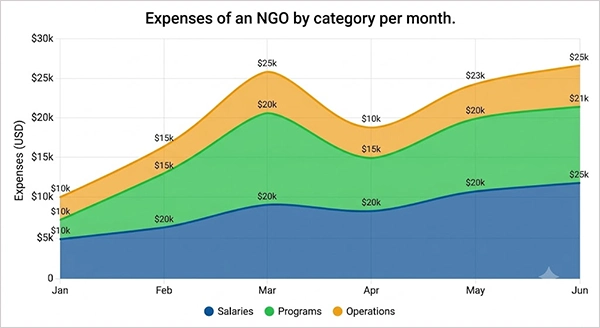
An area chart is like a line chart, but the area below the line is filled with color in an area chart. It is perfect to use for showing sales, and yeah, it’s a great approach for visualizing data with multiple values in total for comparison.
Perfect for: Showing a company’s growth over time.
Example: Stacked area chart representing expenses of an NGO by category per month.
Ignore: Don’t use this chart when the categories overlap, making it unreadable.
7. Treemap
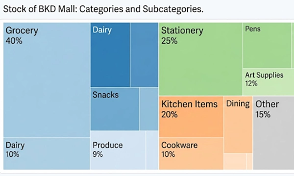
A treemap is perfect to show hierarchical data with rectangles. The size of every rectangle shows a value, and color can also display another value. This chart is an ideal data visualization method that represents individual parts of the whole data along with many subcategories.
Perfect for: Hierarchical data with rectangular shapes, including subcategories.
Example: Stock of the BKD mall with categories like grocery, stationery, and kitchen items.
Ignore: When most values are similar, as rectangles become the same size and are difficult to differentiate.
8. Geographic Map
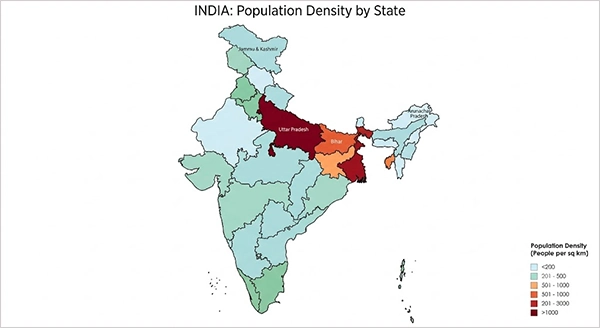
A geographic map, also known as a choropleth, shows regions like cities, countries, or states according to data values. This is one of the best examples of visualization for geographic map charts, like crops by region, population by state, and sales according to cities.
Best for: Showing any data with regions, cities, or states.
Example: Population rate by Indian states displayed on a map.
Ignore: The BKD mall customers are mostly from nearby areas. If they are from small areas, they are more likely to become invisible on the map.
9. Histogram
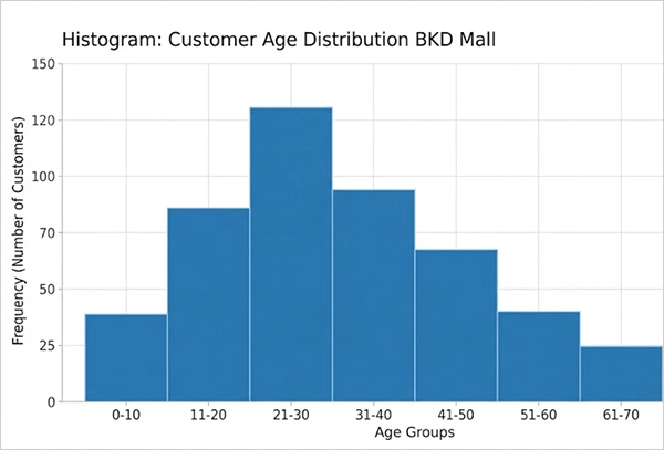
A histogram chart is similar to a bar chart, but it shows the distribution of frequency for a single numeric data type. This is one of the most common data visualization techniques that helps people understand how data ranges. It is useful to show the number of customers in age groups in the BKD mall.
Perfect for: A single numeric variable to show the classification or distribution.
Example: Grouping students in arts, commerce, and science streams.
Ignore: When your datatype is not numeric and category-wise, use a bar chart, not a histogram.
10. Waterfall Chart
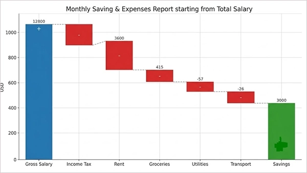
A waterfall chart is used to show how a starting value goes up and down through a string of consecutive steps until it reaches the final stage. It is one of the most popular data visualization techniques people use in operations and production datasets.
Perfect for: Calculating the total value with positive and negative steps.
Example: Saving and expenses report starting from the total salary.
Ignore: When you have more than 10 or 12 steps, you had better not use it, as the chart becomes too crowded to find a clear insight.
Big Data Visualization Techniques
The big data visualization techniques can easily handle large datasets for standard tools to create charts. Because when you have data with millions of rows, your general tools can’t handle it or become useless, like Excel, which can handle only 1,048,576 rows. These special techniques and the tools are designed to work efficiently for large datasets.
Here are the unique methods to handle large datasets smoothly:
| Technique | How It Handles Big Data |
| WebGL-based tools | Utilise the GPU to support millions of points |
| Density plots | Show millions of distribution points without any markers |
| Sampling & aggregation | Remove unnecessary columns from the data before chart creation |
| Progressive loading | Load and show the data in chunks because people mostly zoom and scroll |
| Server-side rendering | Do calculations on the server so that only the image goes to the browser |
| Binning and hexbin plots | Always keep nearby points in bins to ignore overplotting on scatter plots |
There are some tools especially designed for big data visualization, such as Apache Superset, Tableau, Google Looker, and Domo. When you work on large datasets, both the chart type and rendering method are equally important.
How to Choose the Right Method of Data Visualization?
Selecting the most accurate method of data visualization depends on two things: what business question you have to answer and the type of data your files contain. Most people make mistakes when they use a chart of their own choice instead of the one that fits the data perfectly.
- You should check your data type first, whether it is numeric, date, geographic, or categorical.
- Keep it clear in your mind if you have to compare, show a trend, or display a relationship in data.
- Use chart types according to your data points, as a pie chart performs well with only 2 to 3 data points.
- Know your target audience when using a chart because technical people can understand a scatter plot, but non-technical users need a clear bar or line chart.
- Get your charts tested by someone and ask what they can understand within 10 seconds.
Dos and Don’ts of Data Visualization
Keep in mind these guidelines before creating clear and useful visualizations for reports and dashboards.
Dos
- Your chart type must match the data type; therefore, keep it clear what question the chart answers.
- Use colors wisely because the most important trend or line must highlight the results.
- Create a simple chart that shows one clear insight, not a hotchpotch.
- Always begin numeric axes from zero for bar charts to ignore wide differences.
- Use a title and add a legend whenever using shapes or colors in charts for information.
- Always ask someone from the target audience to check the chart before presenting it.
Don’ts
- Don’t hide the Y-axis on the bar charts, as it shows a wide difference with 50 instead of 0.
- Never add pie charts for data with over 4 segments, as it becomes difficult for comparison.
- Don’t add colourful visuals just for decoration; every colour must have a reason
- Don’t include 3D visuals, as these add no helpful value and look awkward in reports.
- Don’t use multiple variables in a single chart; instead, use a different one
Conclusion
The perfect data visualization techniques can convert your complex data into interactive dashboards that help businesses take action. Based on your data and business question, use the appropriate chart options.
It is better to use line charts for sales growth, bar charts for regional sales comparisons, maps for city and county-level data, and scatter plots to visualize relationships. Always ignore using 3D charts and unnecessary visuals.
Next: Create at least three different charts according to your data types using Power BI, Excel, or even Tableau. Include these charts in your next presentation in the meeting, and always be open to improvement as per the feedback.
FAQs
Q1) What are the best data visualization techniques?
The most common data visualization techniques use bar charts, heat maps, line charts, scatter plots, and pie charts.
Q2) What is the difference between data visualization and data and information visualization?
Data visualization means to represent unformatted data in interactive charts and graphs. While data and information visualization use diagrams, visual representation of steps, and infographics, they go beyond numeric data.
Q3) Which is the best data visualization technique for large datasets?
For large datasets, you had better use heat maps, scatter plots, and immersive dashboards. You can easily notice patterns, trends, and relationships to simply analyze and represent complex information.
Q4) What are good examples of data visualization for a business report?
A bar chart for regional sales, a waterfall chart for imports and exports, and a line chart for monthly profits are the perfect examples of data visualization that a business report must have.
Q5) Which data visualization tool should I learn first?
You can start with Excel or Google Sheets for basic and strong fundamentals. Later use Power BI (business intelligence) or the Tableau tool for stunning dashboards.